
Blog
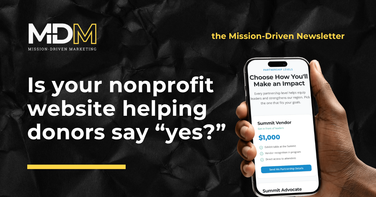
Is Your Nonprofit Website Helping Donors Say “Yes?”
Your nonprofit website is part of your fundraising team
A fundraising campaign doesn’t end when someone clicks a link, opens an email, or sees a social post. It continues through the moment a potential donor tries to understand your work, decide whether to trust you, and complete a gift.
That's why a nonprofit website is more than a digital brochure. It is part of the fundraising infrastructure.
A campaign can create attention. The website has to turn that attention into confidence and action. When the mission is unclear, impact is hard to verify, pages are slow, or the giving path is frustrating, the organization loses momentum at the exact point a supporter is trying to help.
The website has two fundraising jobs
First, it has to help a visitor answer: “Is this organization credible, and does this work matter?”
Second, it has to make the next action feel straightforward: “Can I give, register, volunteer, or learn more without unnecessary effort?”
Those jobs overlap. A prominent Donate button can’t overcome a site that never explains what a gift enables. A compelling story can’t compensate for a form that fails on a phone or adds needless steps. Trust and ease work together.
The 2025 M+R Benchmarks report illustrates the device tension nonprofits should pay attention to: mobile users generated more nonprofit website traffic than desktop users in its participant data, yet completion rates on main donation pages were lower on mobile (8%) than desktop (11%). That's not a universal sector average—the study reflects participating organizations—but it is a useful reminder to test the full donor path on both devices.

Stop treating redesign as the default answer
A site doesn't need to look new to support fundraising well. Often, the highest-value improvement is not a full redesign. It is a focused repair to a point of friction.
Start by looking for the moments that make a visitor hesitate:
- They can’t tell what the organization does within a few seconds.
- The strongest evidence of impact is buried in an annual report or a menu.
- “Donate” is hard to find from a program or campaign page.
- The giving page sends them somewhere unfamiliar without explanation.
- The form asks for more information than is necessary before payment.
- The experience breaks, loads slowly, or becomes hard to read on a phone.
- A prospective donor can’t tell what will happen after they give.
Each is a fundraising problem because each asks the visitor to spend more confidence, time, or attention.
Build the donor path around questions, not departments
Internal organization charts rarely match a visitor’s mental model. A potential donor is usually not asking which department owns a program. They are asking:
- What problem are you solving?
- Who benefits?
- What difference could my gift make?
- Why should I trust this organization?
- What is the simplest next step?
Use those questions to audit the path from a campaign message to a completed gift.
A strong landing page doesn't need to say everything. It needs to make the next relevant thing easy: show the mission, connect the ask to a real outcome, offer supporting proof, and present a clear call to action. Proof can take many forms: specific program details, current results, a short beneficiary story shared with permission, financial transparency, partner information, or a clear explanation of how funds are used.
Avoid overpromising. Concrete and honest usually converts better than grand and vague because it gives people something they can evaluate.

Make mobile a research priority, and test desktop too
Mobile matters because it is often the first place someone encounters a campaign, social post, email, or shared link. A person who can’t read the message, find the giving option, or use the form on a phone may never return on a desktop computer.
But don't translate “mobile-first” into “desktop doesn't matter.” The M+R benchmark result above points the other way: desktop still deserves deliberate testing because many high-intent donors complete gifts there.
Test both paths with the same care:
- Does the page load quickly enough to remain usable?
- Is the mission and call to action visible without a scavenger hunt?
- Does the Donate link stay clear as visitors move between pages?
- Can someone complete a test gift or reach payment without confusion?
- Are recurring-giving and payment options clearly explained where available?
- Does the confirmation and thank-you experience reinforce trust?
Measure the journey, not just page views
Page views can show reach. They can’t show whether your website is helping people act.
Choose a few outcomes that reflect the organization’s goals: donation-page visits, completed gifts, donation conversion rate, recurring-gift selections, volunteer applications, event registrations, qualified inquiry forms, or resource downloads. Review them by traffic source and device when possible.
Then connect the numbers to real observation. Watch someone unfamiliar with the organization try the path. Ask staff what questions arrive repeatedly. Read form-abandonment or support notes where privacy permits. Analytics can reveal where behavior changes; observation often reveals why.

Try a 10-minute donor-path audit
You don't need a major project to find the next improvement.
- Open the website on a phone using cellular data.
- Start on the homepage as if you know little about the organization.
- Time how long it takes to find and read an explanation of the mission and see evidence of impact.
- Find the giving page without using a site search.
- Begin a test donation or carefully inspect the form steps.
- Note every instance of waiting, confusion, or unnecessary data entry.
- Repeat the path on a desktop computer.
- Fix the three highest-friction moments before proposing a wholesale redesign.
This is an exercise in stewardship, not cosmetic perfection. When a supporter is ready to help, a clear, credible, low-friction website honors their attention and gives the mission a better chance to be funded.
Need help finding the friction?
If your organization is preparing for a campaign, refreshing your giving page, or wondering why website traffic is not turning into action, Mission-Driven Marketing can help you review the donor path with fresh eyes.
Schedule a conversation and send the page or campaign path you want to improve. We’ll look for the places where clarity, credibility, and ease could make it simpler for supporters to say yes.
If you enjoy learning about how to market your brand with integrity, subscribe to the Mission-Driven Newsletter and receive articles and conversations like this in your inbox each week.